Overview
Socialsuite is a global leader in ESG and impact measurement software, serving 150+ organizations worldwide, from nonprofits like YMCA and Habitat for Humanity to publicly traded companies on NASDAQ and NYSE.
They came to me with a logo and a set of suggested brand colors. Everything else, the visual language, the photography approach, the typography, and its primary digital application, I designed from there.
The Challenge
Their website didn't match their market position: outdated visuals, a confusing experience, and a homepage conversion rate of 2.15%. The goal was ambitious: double conversions to 4.5% without sacrificing lead quality.
Visual Identity Disconnect
Generic stock illustrations and dated visuals failed to communicate premium enterprise positioning.
Poor Conversion Performance
A 2.15% homepage conversion rate was actively hindering growth.
Audience Confusion
A single "Book a Demo" flow tried to serve two dramatically different audiences, creating friction at every touchpoint.
Original Homepage Design
Inconsistent Messaging & Layout
The Core Insight
The real problem wasn't design, it was clarity. One message can't resonate with both audiences. The brand needed to feel like two experiences in one: unified by visual language, differentiated by intent.
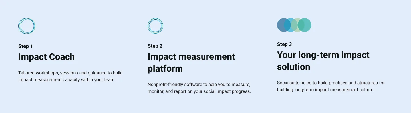
Social Impact Users
- Who: Nonprofits ($1–10M revenue)
- Focus: Community impact reporting
- Buyers: Program directors, grant writers
- Tone: Approachable, mission-focused
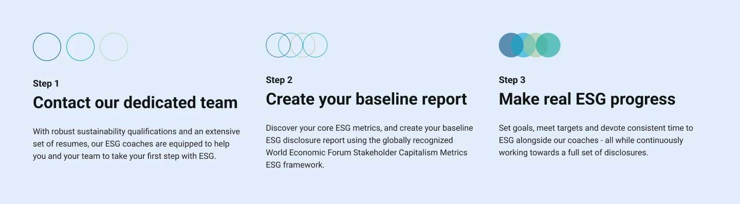
ESG Users
- Who: Public companies ($10M–2B market cap)
- Focus: Regulatory compliance
- Buyers: C-suite, sustainability officers
- Tone: Professional, data-driven
I mapped each journey separately: a nonprofit program director and a Fortune 500 sustainability officer have completely different pain points, vocabularies, and trust signals. That shaped everything downstream, from navigation structure to imagery to CTA placement. Rather than designing two sites or splitting the brand, I designed one language that shifts register through tone, imagery, and hierarchy. The brand stays unified; the conversation doesn't.
Structure First
I wireframed the core templates with the Socialsuite team to map user flows and content hierarchy, solving the structural problems before layering on brand. The homepage had to route two audiences to relevant content fast; industry pages had to speak directly to sector needs. The wireframes became the alignment tool for stakeholder buy-in before committing to pixels.
Homepage Wireframe
Industry Page Wireframe
Visual Direction
With structure locked, I tested three directions for how the brand could feel:
Direction A
Energetic & Bold
Yellow-gold with teal accents: energy and optimism, but risked feeling too playful for enterprise.
Direction B
Premium & Confident
A deep ocean-to-teal gradient anchored by the brand's circular motifs. Enterprise credibility without feeling cold.
Direction C
Clear & Minimal
A clean, light background letting product UI and brand shapes lead. The most restrained option.
We landed on a variation of Direction B, the teal gradient: distinctive enough to feel fresh, professional enough for enterprise credibility, flexible enough to work across both audiences.
The Brand Language
Color
A two-tier palette: primary tones that carry the brand's weight, and a secondary set that lets the language shift register, warmer for nonprofit contexts, more restrained for enterprise.
Primary Colors
Ocean
#014682Lagoon
#00a0aaSecondary Palette
Sky
#00a0c8Grass
#bcc896Leaf
#00a096Deep Water Gradient
The ocean-to-lagoon gradient became the brand's signature surface, used in hero moments and key brand statements. It's the single most identifiable element of the brand's digital expression.
Typography
One typeface that carries both registers without shifting voice: readable for data-heavy ESG content, warm enough for impact storytelling.
Circles as the Visual Alphabet
The logo is built from overlapping circles. The strongest move in the project was extending that geometry into a complete visual language rather than treating the logo as an isolated mark: concentric circles, overlapping shapes, photo frames, section dividers. The circle became the brand's atomic unit, a signature shape language that didn't need illustration to feel distinctive.
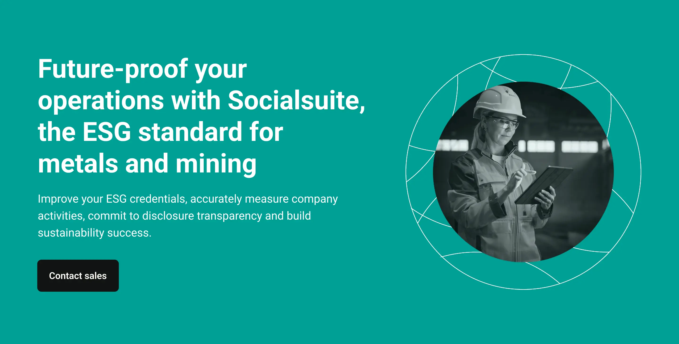
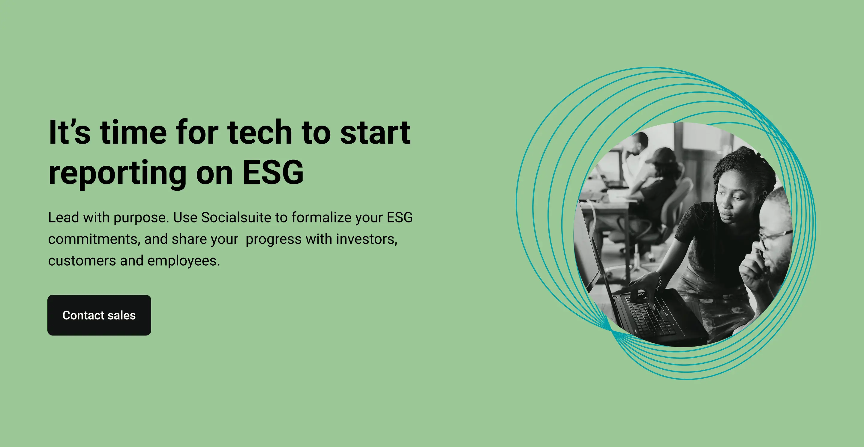
Photography as the Anti-SaaS Move
SaaS brands default to abstract illustration. When the team decided against illustrations, I proposed the opposite: real people in black-and-white, framed in the brand's circular geometry with subtle color overlays. A human register essential for the nonprofit audience, distinctive enough to carry enterprise credibility. One treatment, two audiences.
Icons
The Phosphor library in duotone style: a comprehensive set carrying the brand's aesthetic across website, product interface, and marketing materials.
Designing for Conversion
The original demo form asked for everything upfront, friction that was costing real conversions against the 4.5% target. I redesigned it with progressive disclosure: start simple, reveal complexity only when needed. Perceived effort dropped while lead quality held for the sales team.
Redesigned Demo Form, Progressive Disclosure in Practice
The Final Brand
Outcome
165+
Organizations served worldwide
2×
Conversion rate target achieved
"It was fantastic to work with Omar - from start to finish he was a delight to work with! Omar went above and beyond to help us deliver our project on time - going above and beyond the original scope of work to help us create an incredible website. His training on the CMS was fantastic, and I recommend Omar to anyone looking for assistance with a Webflow site!"
The visual language has since been adopted across Socialsuite's product interface, sales materials, and investor presentations, outliving the website engagement as the company's working brand system.
Reflection
Socialsuite is the project where I learned how much of brand design happens after the logo.
A logo and a color palette aren't a brand. They're the starting ingredients. The brand is everything that happens next: the shape language, the photography system, the gradient logic, the way typography behaves, the decisions about what the brand chooses not to do. That gap, between a brand's ingredients and a brand that actually works across every surface it needs to, is where I do my best work.