Overview
ColorCoded Labs is a tech bootcamp in Columbus, Ohio, preparing students for careers in tech and connecting graduates with employers. After a successful pilot, the team was scaling: new programs, growing press coverage, enterprise partnership conversations. I led a brand system rework and website redesign that turned a standalone identity into a digital brand language the team could operate themselves.
The Challenge
The brand had launched bold: vibrant colors, a distinctive mark, a name promising energy. But it was built for print and standalone identity work, with no rules for how color, type, or layout should behave on a growing website. On screen, everything competed. The brand meant to signal energy was reading as noise.
Designed for Impact, Not Scale
Applied across a whole site, every element ended up in brand color, every section feeling equally important.
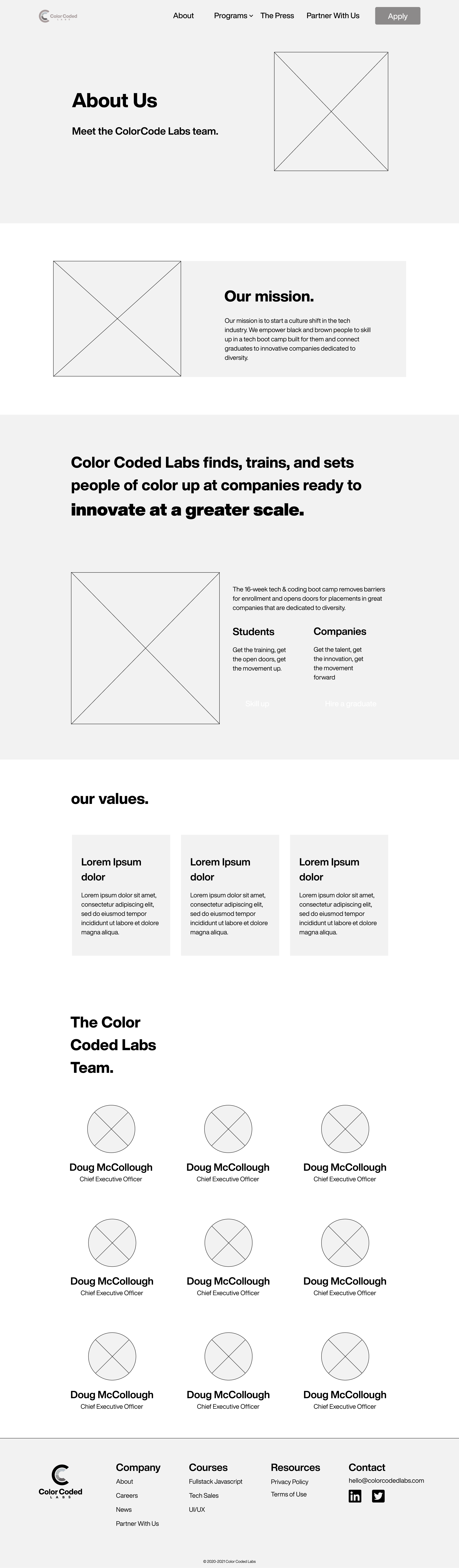
Site Built for a Pilot
The original site supported one product. Multiple programs, press, and partnerships had no structure to live in.
Team Blocked From Their Own Brand
Course updates, deadlines, and press mentions all required developer intervention.
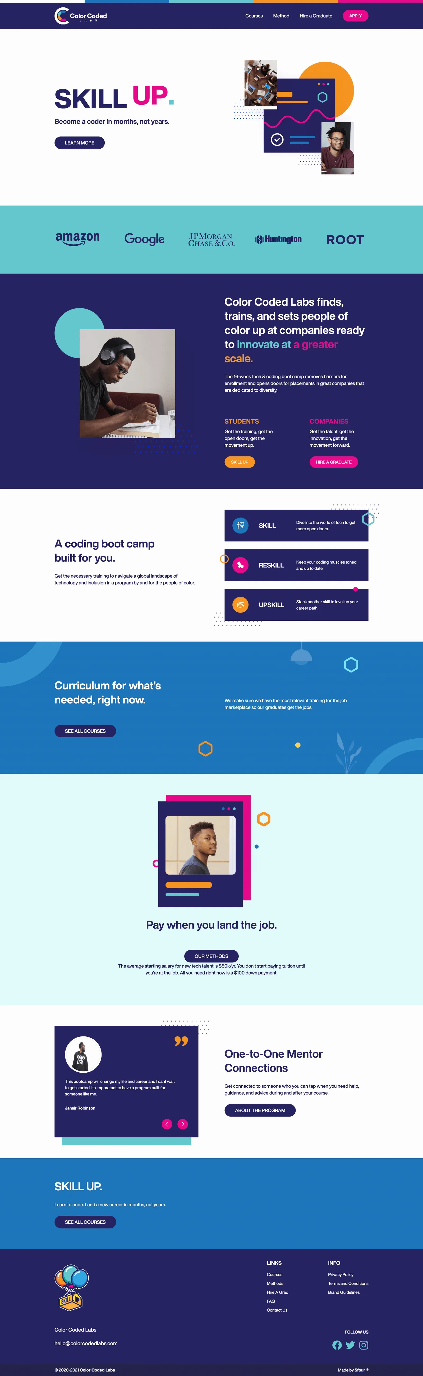
Original Pilot Site, Brand Color Everywhere
No Visual Hierarchy Between Sections
The Core Insight
The company is called ColorCoded Labs. But nothing in the identity actually did anything color-coded.
The palette hinted at the concept, five colors, a color-banded logo, but there were no rules for how those colors should behave, so the site used all of them at once, everywhere. The brand's own name was making a promise its design language wasn't keeping. The real work was turning that name into a design instruction: a language with rules about where color lives, what it signals, and when it should be quiet.
My diagnosis to the client: "The colors concept is strong, but it's being overused on the website in a way that's making the concept less impactful. More whitespace and high-contrast foundations will make the brand colors stand out, not disappear."
Structure First
Before any visual design, I wireframed the priority templates, homepage and about, to map hierarchy and align with stakeholders before committing to visuals. The wireframes surfaced the structural gaps (missing About page, partnerships section, press archive) as design decisions rather than afterthoughts.
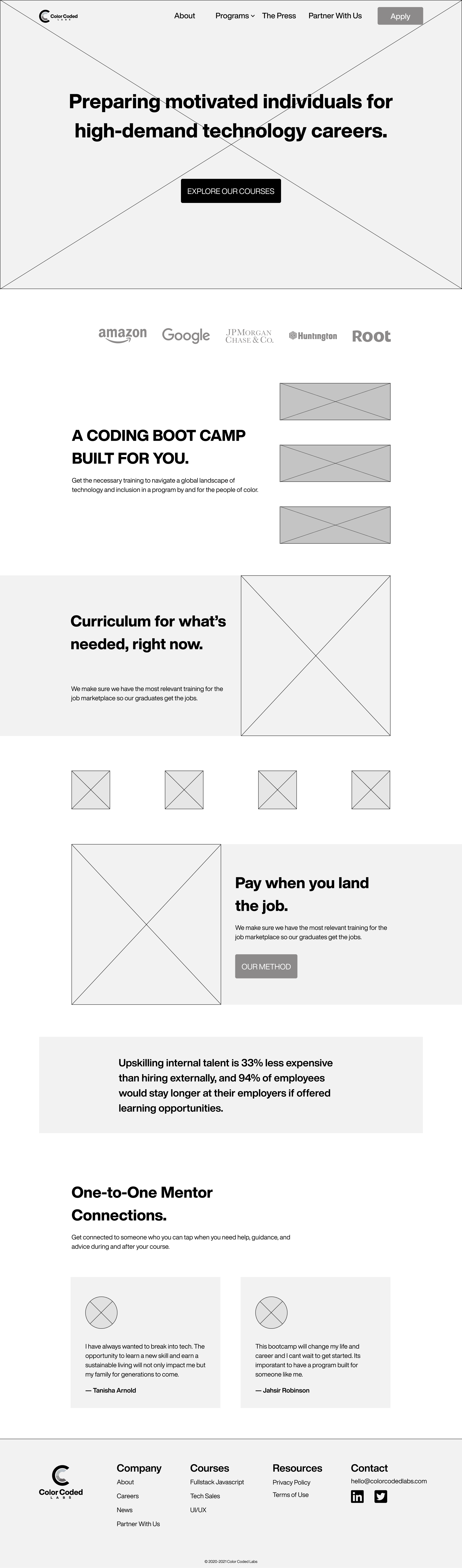
Homepage Wireframe
About Page Wireframe
The Brand Language
A Foundation to Rest On
The original palette had no rest states. Every color was fully saturated, nothing signaled "quiet." I added three foundation tones to give the brand somewhere to land.
Xiketic
#18172DCultured
#F2F2F2White
#FFFFFFBrand Colors, New Roles
Midnight Blue
#262262French Blue
#1C75BBDark Turquoise
#61C7CFCarrot Orange
#F6931DDeep Cerise
#EB008BThe colors didn't change. Their roles did. The rule was 90/10: 90% neutral foundation, 10% brand color, reserved for primary CTAs, program identity, key data, and interactive states. When color appears, it means something. And rather than decorate with the palette, I assigned it: each course owns a color that carries through its entire experience, from first impression to enrollment, with room for future programs to join without reinventing the system.
Typography
The brand's existing voice, extended into a responsive digital type scale covering the contexts the print-oriented guidelines never did: navigation, forms, metadata, stat displays, and dense curriculum sections.
Delivering on the Name
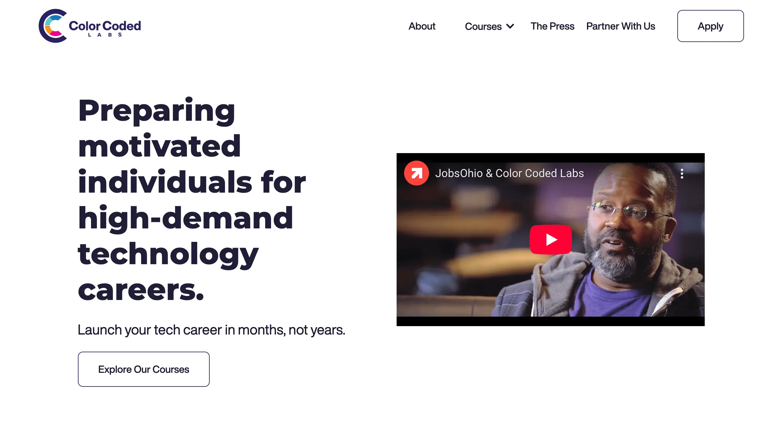
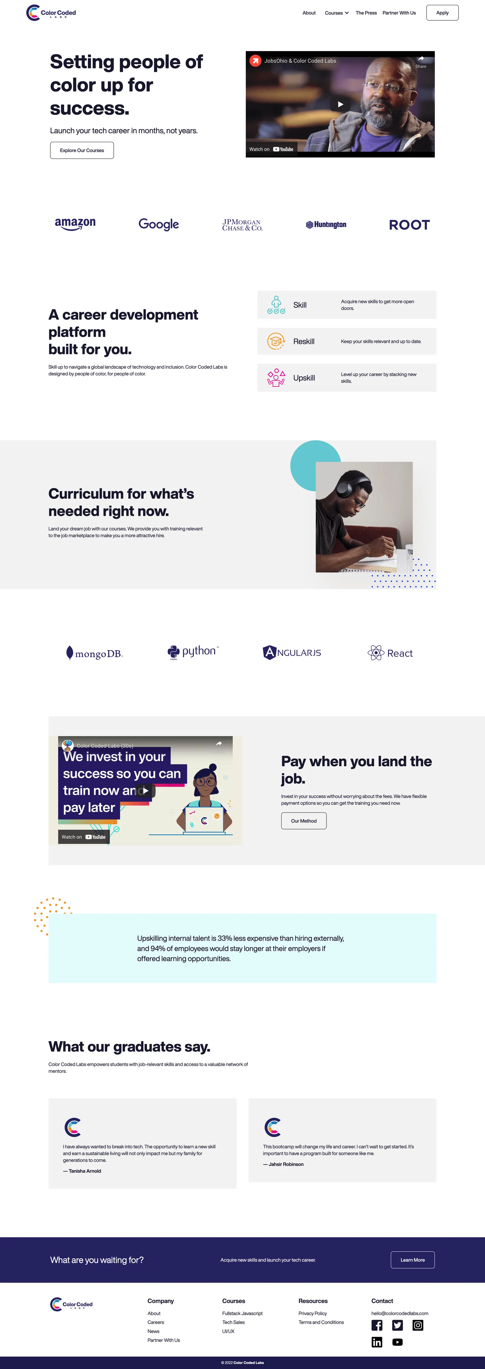
The homepage hero assigns each letter of the headline a color from the brand palette, with a subtle interaction cycling letters through the palette on hover. The first thing a visitor reads on the site is literally color-coded. The concept stopped being a description and became an experience.
Hero Headline, Interactive Color-Coded Letters
Convincing a client with a deliberately vibrant brand that less color would make the brand stronger required trust. The argument: when every color is shouting, none of them signal anything. Pulling brand color back to 10% of the interface gave every CTA, every program marker, and every key moment real visual weight.
The system also had to survive the team operating it. I built the CMS so the language's rules, color assignment, component patterns, and visibility logic live in the content model itself. When the team adds a new course, they pick a color; the system handles the rest. The brand stays consistent because the infrastructure enforces it.
Applying the Language
Every page is assembled from the component library. Every use of brand color is deliberate. Every program is visually distinct, but clearly part of the same brand.
Homepage
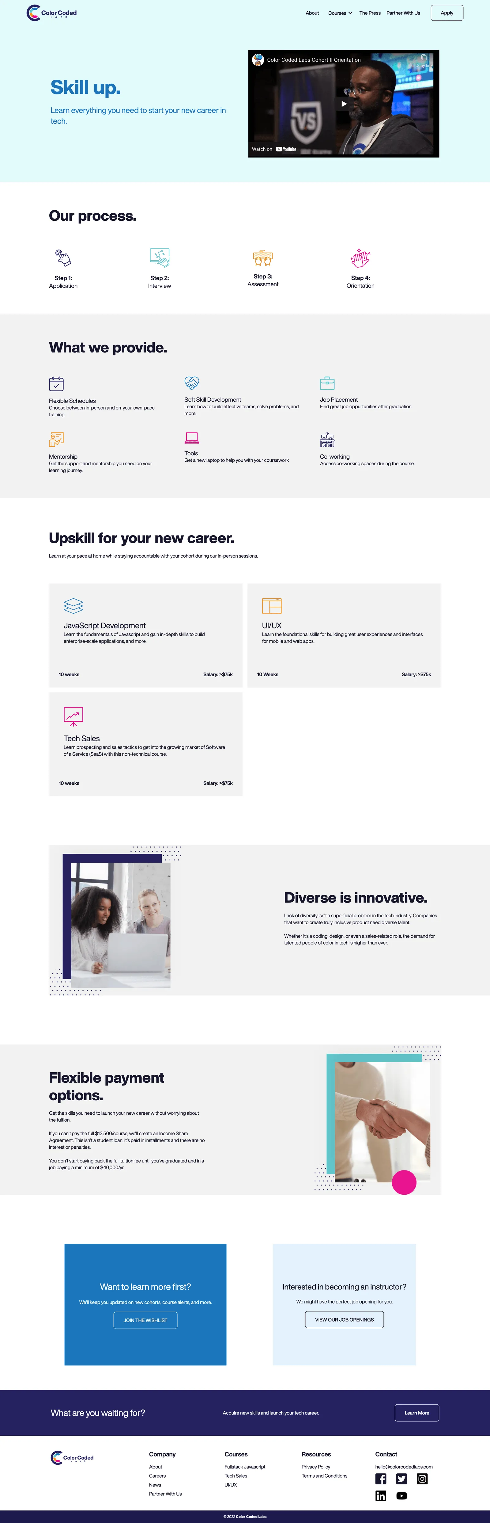
Course Offerings, Per-Program Color Identity
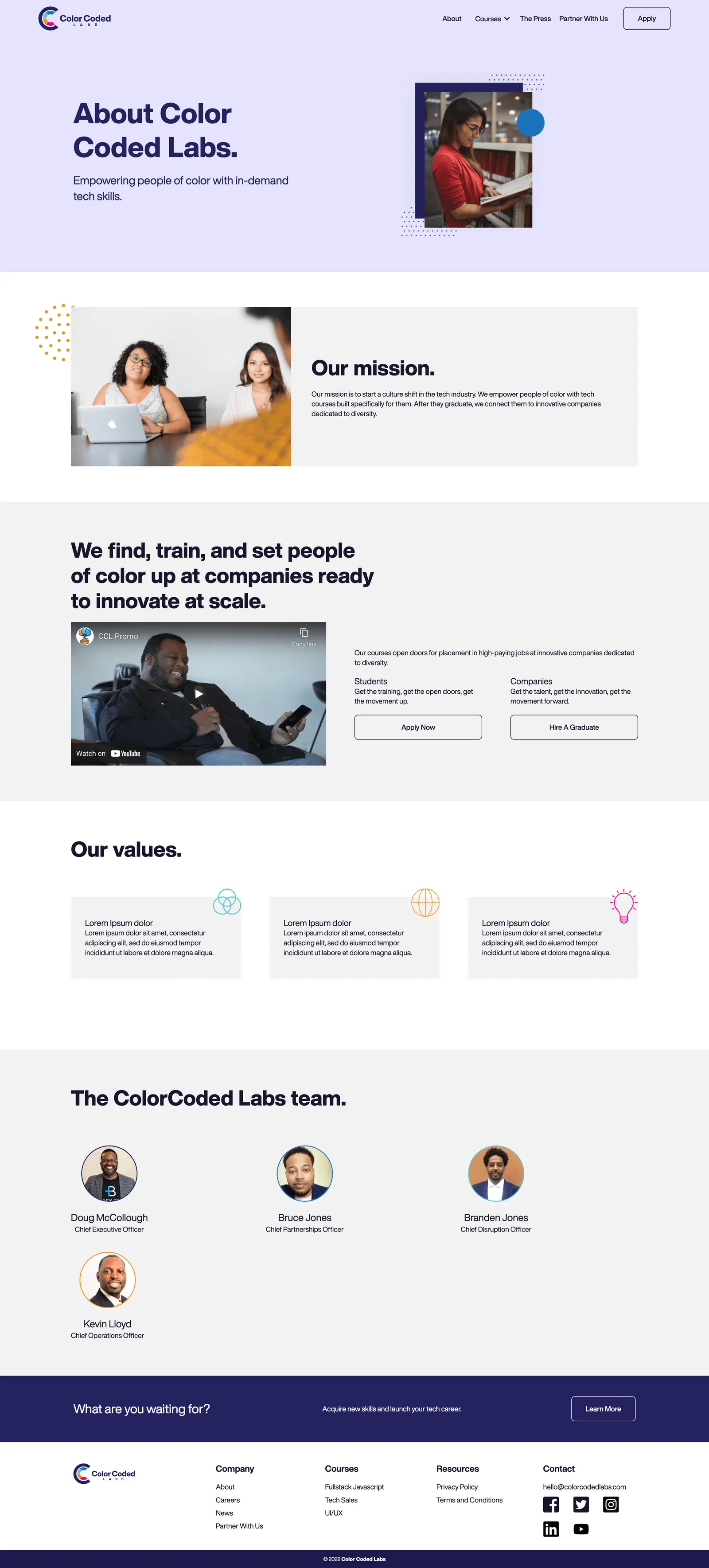
About Page
Outcome
Delivering on the Name
"Color-coded" became part of the design language, carried through micro-interactions, iconography, and per-program color identity.
Full Content Independence
The team owns course launches, enrollment updates, and press publishing end-to-end, with the brand's rules baked into each component.
Reflection
ColorCoded Labs' identity was never the problem. The brand had just never been given a language: rules for how its own concept should behave. The most important decision I made wasn't visual. It was noticing that the brand's name was already telling us what the design language should do, and building the rules to match.