Overview
Eon Aligner is a clear-aligner brand with a growing network of certified providers across the Middle East. The brief served two distinct users: patients trying to find nearby clinics, and a marketing team that needs to manage listings without an in-house developer.
I owned the project end-to-end: translating the marketing team's business requirements into a technical solution, designing the UX and UI, building the React frontend, and implementing a headless Airtable CMS for the provider network.
The Challenge
A doctor finder sounds simple until you hold it to three standards at once.
Patient Experience First
Find a certified provider in seconds, with map context and a clear next step to directions. It had to feel native to how people already use Google Maps.
Accessibility at the Core
A healthcare-adjacent audience meant accessibility from the first commit, not retrofitted after launch.
Full Autonomy for Marketing
Adding a clinic, updating hours, or removing a provider couldn't require a developer.
The Core Insight
The most valuable thing I could build wasn't the map. It was a system the team could extend without me.
Two foundations had to land before any interface work: a small design system with tokens named by purpose (brand, ink, surface) instead of by color, and a CMS the marketing team already understood, Airtable, so the patient-facing map became a thin, fast view over data they already owned. Every other decision, from component structure to the serverless proxy to the lazy geocoding, flowed downstream from those two.
The win wasn't the React app. It was a design system any future contributor could read, and the absence of a developer in the loop every time a new clinic opened.
How It's Built
A Semantic Token Layer
Eleven color tokens, one font, four radius steps, defined with Tailwind v4's @theme directive and named for the role they play, not the color they currently are. A class like bg-surface tells the next developer what something is; bg-white only tells them the color. That distinction is what separates a palette from a design system. Components are built against tokens, not hex values, so a future palette change or dark-mode pass is a single-file edit, not a refactor.
Accessibility From the First Token
Every surface meets WCAG AA contrast, verified token by token. When the brand teal failed AA against white, the fix was a system-level swap so every CTA inherited the correction automatically. Accessibility lives in the tokens, not in patches.
The markup follows through: doctor cards are real <button> elements with aria-pressed, not styled divs. Loading states sit in role="status" live regions, errors in role="alert", and a visible-on-focus skip link gets keyboard users straight to the content. The app is fully usable with a keyboard alone or a screen reader alone.
Airtable Over a Custom Admin
A bespoke CMS would have been a project of its own, and another tool for marketing to learn. Making Airtable the source of truth meant the team's spreadsheet fluency became their CMS skill set on day one. Adding a clinic is the same as adding a row. The API key never touches the browser: a single Netlify Function proxies Airtable, handles auth and pagination, and returns sanitized data with a 5-minute cache. The whole backend is one file with no infrastructure to maintain.
A Map That Responds to Intent
Zoom level is tied to what the user just selected. A doctor zooms to street level and centers on the clinic. A city zooms to neighborhood level, centered on its providers. A country alone calculates the geographic centroid of every doctor in it and zooms to regional level. The camera always lands on something useful.
Geocoding (a paid Google API call) is lazy and cached in two tiers: an in-memory Map for session-fast lookups, persisted to localStorage so addresses survive across visits. It only runs when a user opens a doctor's info window.
Tech Stack
Frontend
React 19, Vite, Tailwind CSS v4
Design System
Custom token layer (colors, type, radii) in Tailwind @theme
Maps
@vis.gl/react-google-maps, Advanced Markers and Geocoding
Backend / CMS
Airtable as a no-code database, proxied through a Netlify Function
Outcome
A live, production tool the marketing team operates independently, on a frontend foundation any future contributor can extend.
Zero Developer Bottleneck
Marketing adds, edits, and removes providers in Airtable. Changes show up live without a deployment, a ticket, or a developer.
A Foundation That Scales
Semantic tokens and accessibility-first components mean future work, new countries, dark mode, a brand refresh, is incremental rather than a rebuild.
Project Images
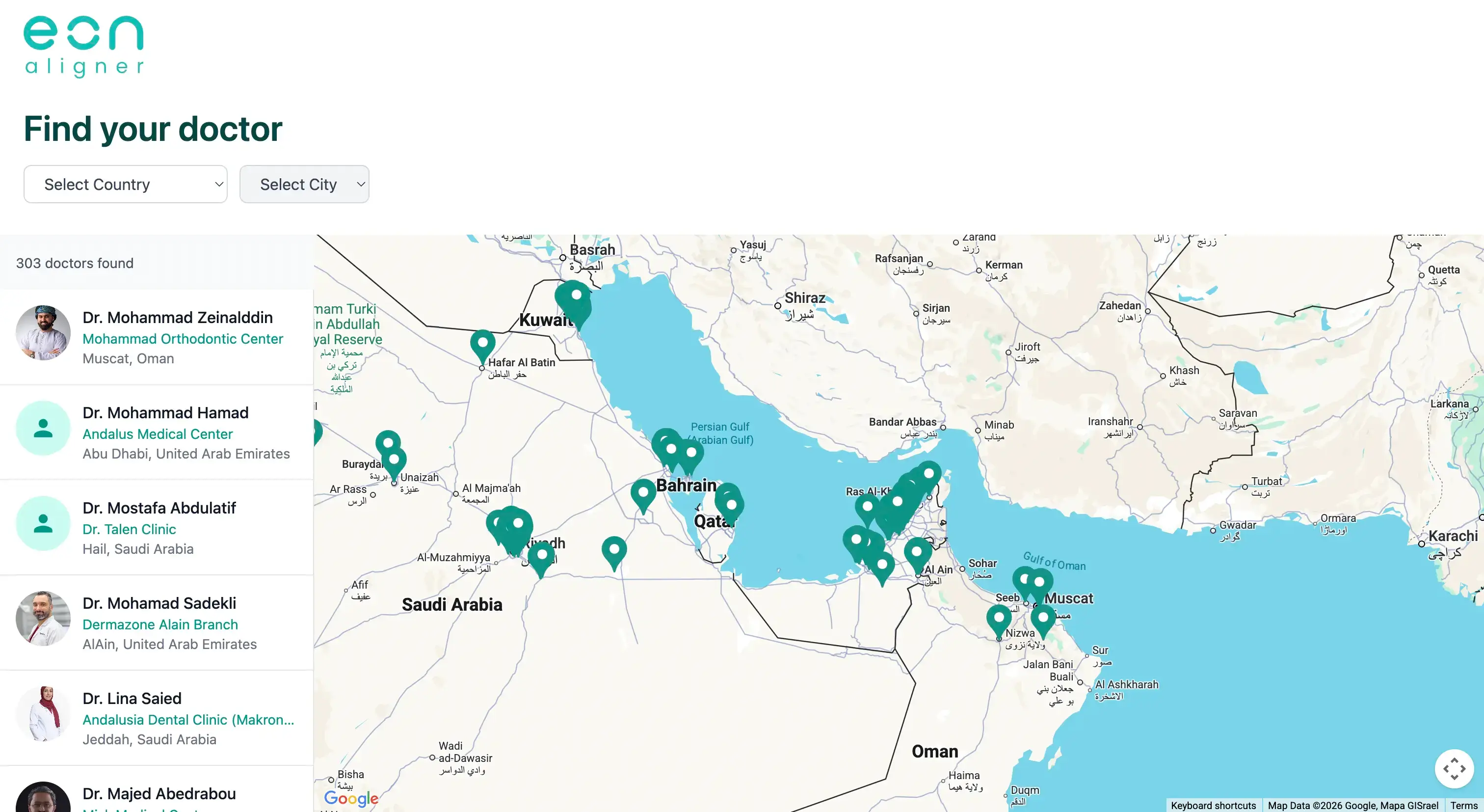
Initial Map View, Clinics Across the Network
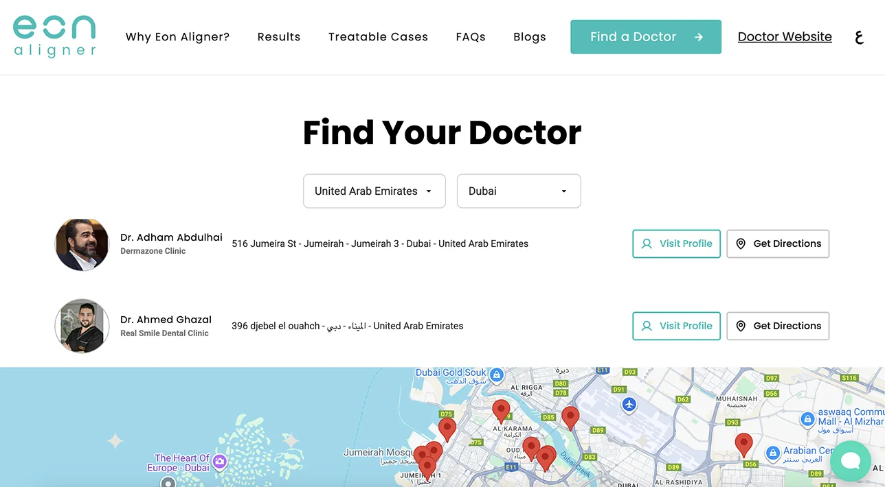
Cascading Country and City Filters
Reflection
The interesting work on this project wasn't the React app. It was figuring out what the marketing team's problem actually was.
A "doctor finder" sounds like a frontend project. But the team's real problem wasn't a missing interface, it was that every clinic update required a developer. Once that's the framing, the answer stops being "build a better UI" and starts being "remove the developer from the loop." That meant Airtable instead of a custom admin, semantic tokens instead of hardcoded values, and a small focused system instead of a heavier framework.
Three weeks of work, scoped to what the team actually needed. Not bigger, not smaller. That's the part I'm proudest of: judgment about where to draw the boundaries, and not building an over-engineered solution.