Overview
248.AI is a San Francisco startup building production AI applications for enterprise, centered on composability: reusable AI agent building blocks that combine to solve complex problems.
My role was to develop the full brand expression around their existing dot-based logo, then design and build its first major application: the live website, including a custom interactive hero.
The Brief
Take a minimalist dot-based logo and build a brand around it that feels as intelligent and understated as the product it represents.
Minimal, Not Empty
No heavy illustration, no stock imagery. But minimalism without substance reads as unfinished. The brand needed a conceptual anchor strong enough to carry a quiet visual language.
Logo as Starting Point
The dot-grid wordmark was distinctive but isolated. The system around it had to extend the logo's own logic, not contradict it.
Intelligence as a Feeling
AI brands default to dark mode and neon gradients. The client wanted the opposite: quieter, more literate, confident enough not to announce itself.
The Core Concept
The brand should behave like the product it represents.
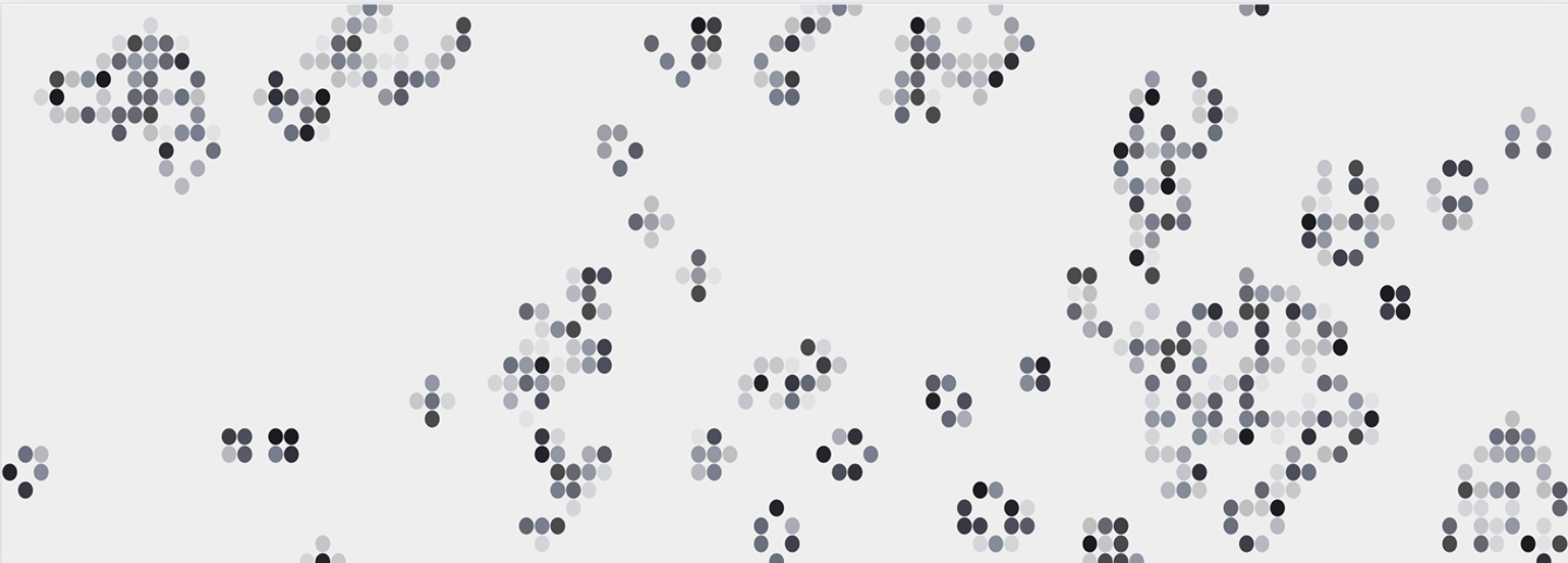
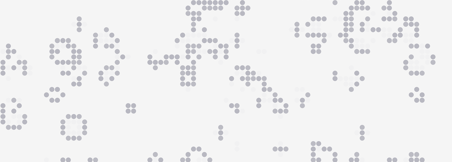
248.AI's philosophy is composability: simple, reusable agents combining into systems more intelligent than the sum of their parts. Conway's Game of Life is the cleanest visual metaphor for that idea, a grid where simple local rules produce emergent, living patterns. And it's exactly what the dot-grid logo already suggests: the dots aren't decoration, they're the substrate the Game of Life runs on.
The brand is literally a Game of Life. The logo is the rule set; everything else is what happens when you run it.
Brand Direction
I explored three visual languages before committing, each a different answer to "what does intelligent minimalism feel like?"
Direction A
Technical & Editorial
Monospace, structured grids, dense hierarchy. Reads like a research paper. Precise, but cold for a broad audience.
Direction B
Quiet & Literate
Clean sans, generous whitespace, restrained grayscale, and a conceptual anchor that rewards attention. Confident enough not to shout.
Direction C
Futurist & Expressive
Dark mode, gradients, glow. The category default, and exactly the convention the client wanted to avoid.
We landed on Direction B, Quiet & Literate. It rejected the AI-category clichés without sliding into academic austerity, and it made the Game of Life concept legible: a quiet brand could surprise you with an interactive hero. A loud one would drown it out.
Exploration
Finding the execution took a wide range of layout and hero studies: headline-to-grid relationships, type scales, warmer vs cooler neutrals, and how aggressively the dot system should read as "tech" versus "editorial."
Visual Language
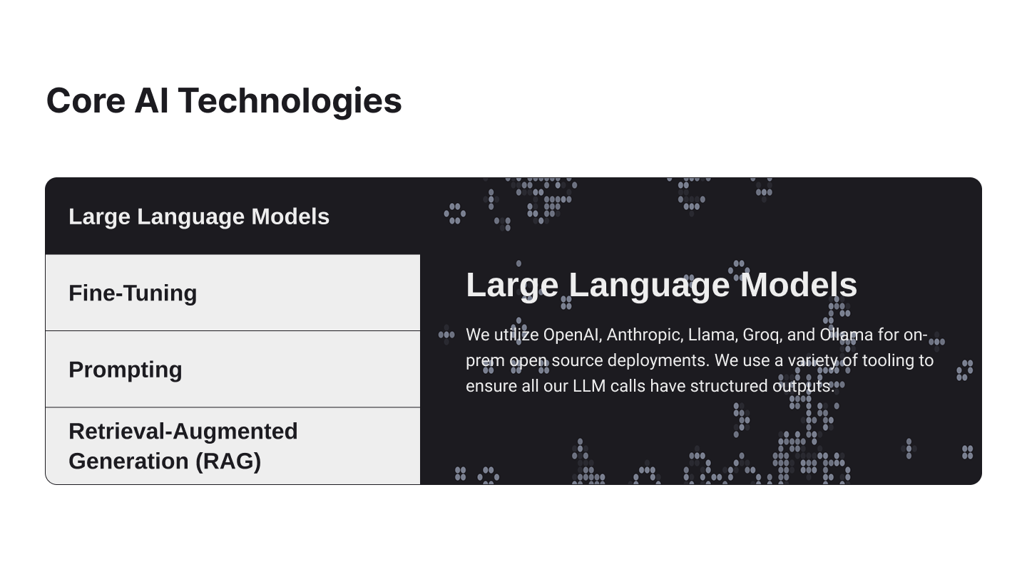
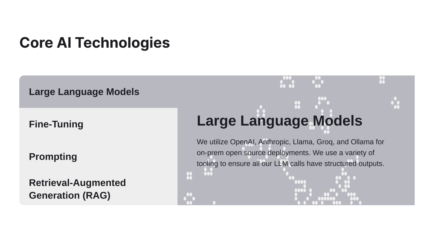
The logo establishes the visual alphabet: dots on a grid. That alphabet extends across every scale. At logo scale, dots form the wordmark. At hero scale, they populate the viewport as a live Game of Life. At interface scale, they become loading indicators and structural marks. Whitespace and grid logic echo the same geometry throughout. One element, scaling from brand mark to ambient texture.
Color
Obsidian
#1C1B20Graphite
#40404DStone
#787E8EMist
#B8B8C1Canvas
#EEEEEEA five-stop grayscale with no accent hue. In a category drowning in gradients, removing color is itself a positioning statement: the brand's meaning lives in pattern, rhythm, and composition, the same things that make the Game of Life interesting. Each tone has a structural role, from Obsidian for primary text down to Canvas for rest states.
Typography
Inter, for its optical precision and neutrality. Most AI brands reach for geometric display faces or eccentric serifs to signal sophistication; Inter steps back and lets the content lead. Hierarchy comes from size and color, not weight acrobatics.
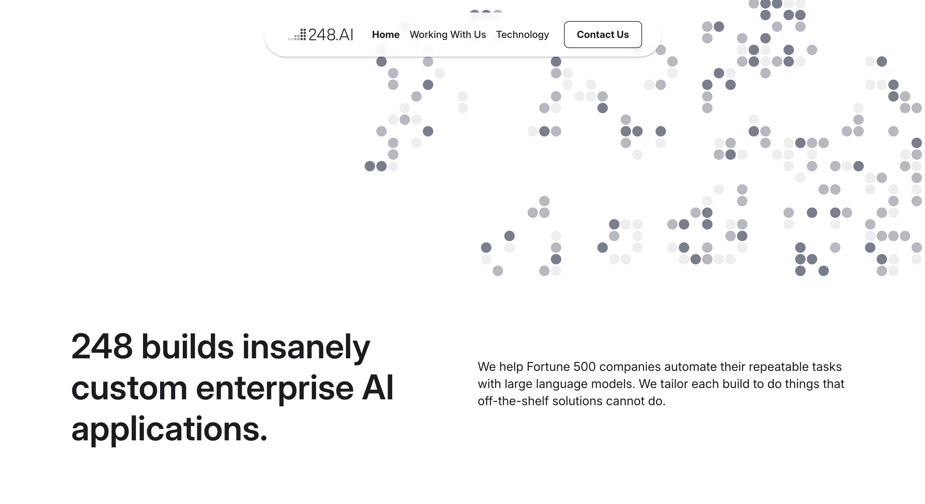
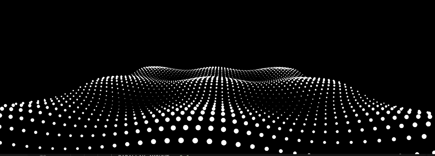
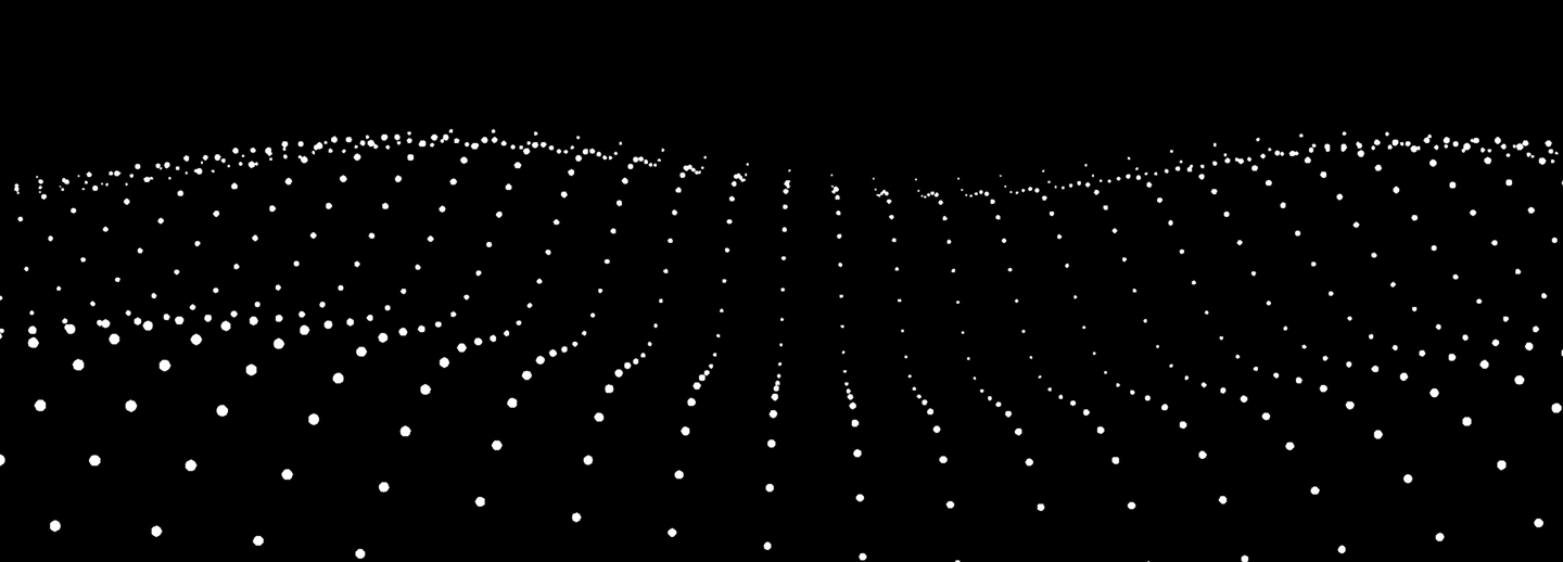
The Interactive Hero
The brand's first impression is not a static image. It's a fully functional Conway's Game of Life running live in the browser, cells being born, surviving, and dying in real time. This is the same implementation powering the homepage, embedded here:
Live Embed — Hover to Seed New Patterns
I built this in vanilla JavaScript, tuned specifically to the brand:
- Viewport-adaptive grid. The simulation scores candidate cell sizes against coverage and aspect ratio, then self-calculates the optimal grid for any screen. It always fills the viewport without breaking rhythm.
- Brand-native color. Born cells pick at random from the three mid-tone grays, creating subtle chromatic variation as patterns evolve.
- Participation, not decoration. Hovering seeds gliders, blocks, and blinkers at the cursor. Passive viewing becomes play.
- Weighted seeding. Initial cell distribution is sparse on the left, where the headline sits, and denser on the right, where the simulation takes visual priority. The text lives inside the brand's logic, not next to it.
- Contemplative pacing. Generations tick every 2.4 seconds. Slow enough to be calm, fast enough to feel alive.
Key Pages
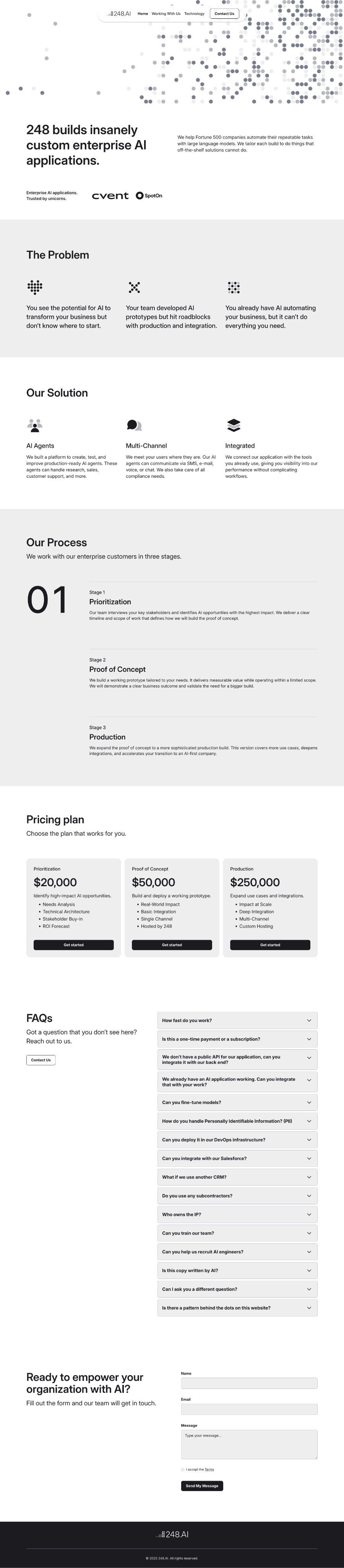
Homepage
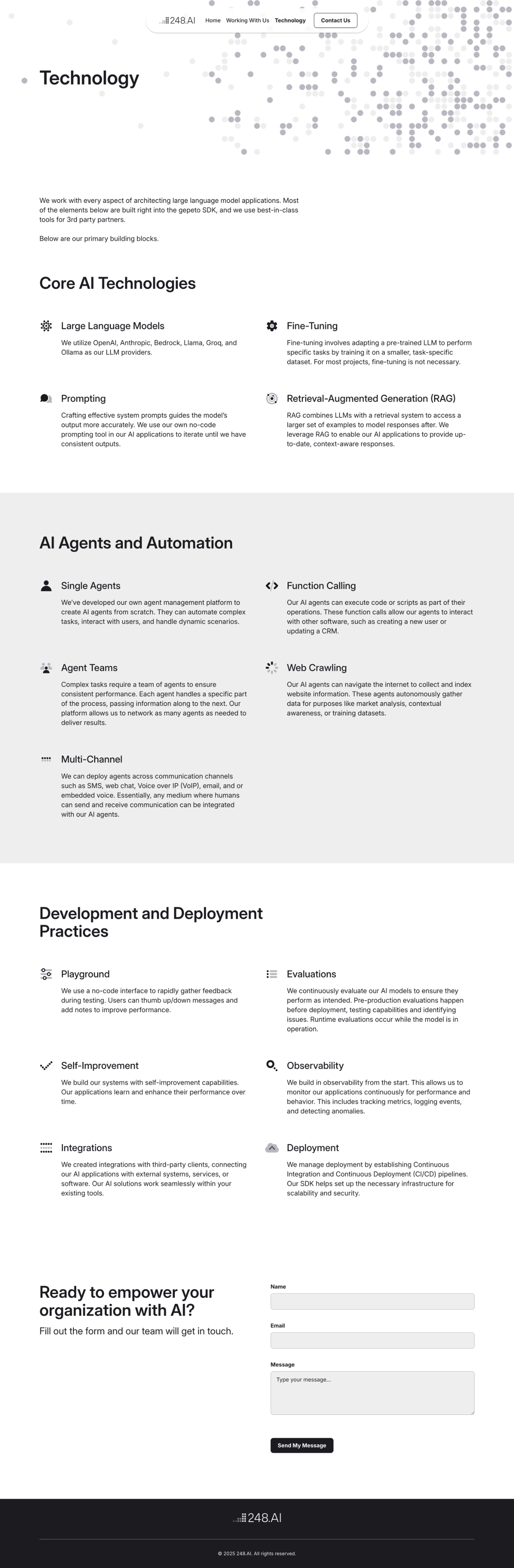
Technology
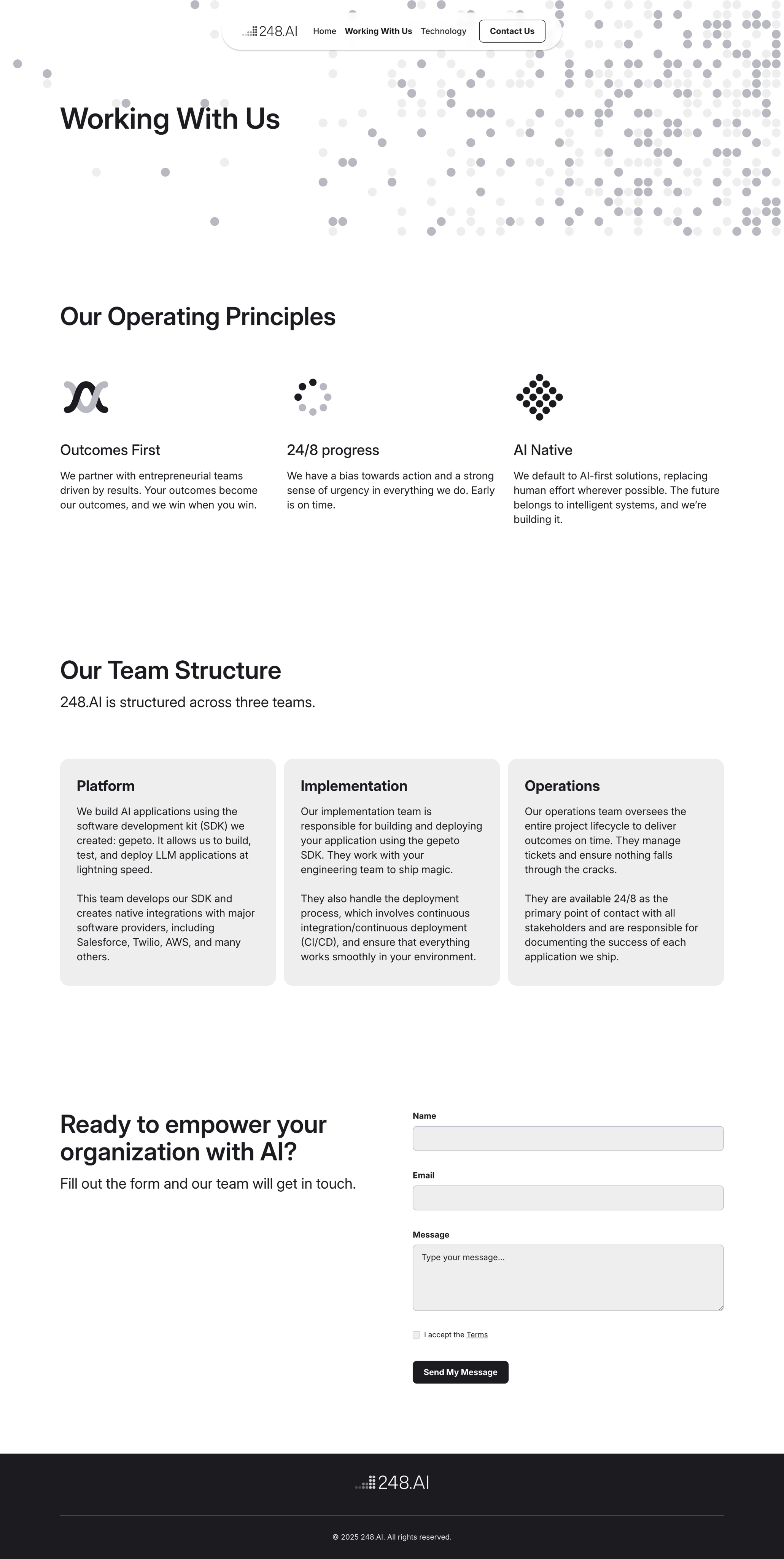
Work With Us
Outcome
The brand launched with the website as its first surface. The Game of Life hero became its signature moment: instantly recognizable, conceptually anchored, and alive in a way most brand heroes aren't.
A Brand That Behaves Like Its Name
A company whose product builds emergent intelligence from simple rules opens every visit with the Game of Life itself.
Visual System That Scales
Three principles, dots, grayscale, and restraint, that extend cleanly from the logo mark to any future surface.
Reflection
248.AI taught me how much of brand design is restraint. A color, photography, or the standard AI-category look would each have made the brand louder and weaker. The strongest move was taking things away until what remained was just enough to carry the concept: a grid, some dots, a typeface, and one living idea.