Project Overview
Client: Socialsuite
Industry: ESG & Impact Measurement Technology
Project Type: Complete Website Redesign & Visual Identity Overhaul
Timeline: 6 weeks (November-December 2022)
My Role: Lead Designer & Developer
The Challenge
SocialSuite, a global leader in ESG and impact measurement software serving 150+ organizations worldwide—including YMCA, Big Brothers Big Sisters, and publicly traded companies—had just completed a comprehensive rebrand. Their existing website had become a critical bottleneck: outdated visuals, a confusing user experience, and alarmingly low conversion rates that didn't match their market position.
The Core Problems
1. Visual Identity Disconnect
The existing site relied heavily on generic stock illustrations and outdated branding that failed to communicate their premium positioning as an enterprise software provider serving both Fortune 500 companies and leading nonprofits.
2. Poor Conversion Performance
With a homepage conversion rate of just 2.15%, the site was actively hindering growth. The client's goal was ambitious but necessary: double conversions to 4.5% while maintaining lead quality.
3. Audience Confusion
A single "Book a Demo" flow attempted to serve two dramatically different audiences:
-
Social Impact users: Nonprofits ($1-10M revenue) focused on community impact reporting
-
ESG users: Public companies ($10M-2B market cap) navigating regulatory compliance
This one-size-fits-all approach created friction at every touchpoint.
Original Homepage Design
Inconsistent Messaging & Layout
Discovery & Strategy
Understanding Two Distinct Audiences
Social Impact Segment
- Mission-driven nonprofits and NGOs
- Primary need: Demonstrating community impact to funders
- Decision makers: Program directors, grant writers, executive directors
- Pain points: Complex reporting requirements, limited technical resources
- Tone: Approachable, mission-focused, impact-driven
ESG Segment
- Public and pre-IPO companies beginning ESG journey
- Primary need: Meeting regulatory requirements and investor expectations
- Decision makers: C-suite executives, sustainability officers, investor relations
- Pain points: Navigating complex frameworks (TCFD, GRI, SASB), stakeholder pressure
- Tone: Professional, data-driven, compliance-focused
Competitive Analysis & Design Direction
I analyzed the client's reference sites (Slack, Wealthsimple, Pingboard, Flyhyer) and identified key patterns:
- Clean, spacious layouts with generous whitespace
- Custom illustrations that reinforce brand personality
- Clear, benefit-focused value propositions above the fold
- Conversion-optimized CTAs with minimal friction
- Strong visual hierarchy guiding users to key actions
Strategic Approach
Visual Strategy
Move from generic SaaS aesthetics to a sophisticated, purpose-driven design language that bridges corporate professionalism with nonprofit authenticity.
Conversion Strategy
Implement separate, optimized demo flows and tailored value propositions for each audience. By reducing form friction through progressive disclosure and strategically placing social proof throughout the user journey, we streamlined the path to action and increased overall trust.
Visual Identity Development
Based on the rebrand, I created an extended color palette, typography system, iconography set, and a photo asset guidelines to ensure brand consistency across all touchpoints.
Color System & Typography
The rebrand provided a sophisticated color palette that I needed to translate into a functional web system:
Primary Colors
Ocean
#014682Lagoon
#00a0aaSecondary Palette
Sky
#00a0c8Grass
#bcc896Leaf
#00a096Deep Water Gradient
A sophisticated blue-to-teal gradient that added depth while maintaining accessibility—used strategically in hero sections to create visual interest without overwhelming content.
Typography: Roboto
Characters & Numbers
OPQRSTUVWXYZ
abcdefghijklmn
opqrstuvwxyz
1234567890!@#$%
I selected Roboto for its versatility and clean, modern aesthetic. Its excellent readability across screen sizes and weights made it ideal for both data-heavy ESG content and emotion-driven impact storytelling.
Custom Illustration System
The Brief's Direction
"Custom design over stock photos... visual identity to be driven by our mission and vision"
My Approach
Rather than generic SaaS illustrations, I developed a distinctive visual system that merged authentic photography with geometric abstraction:
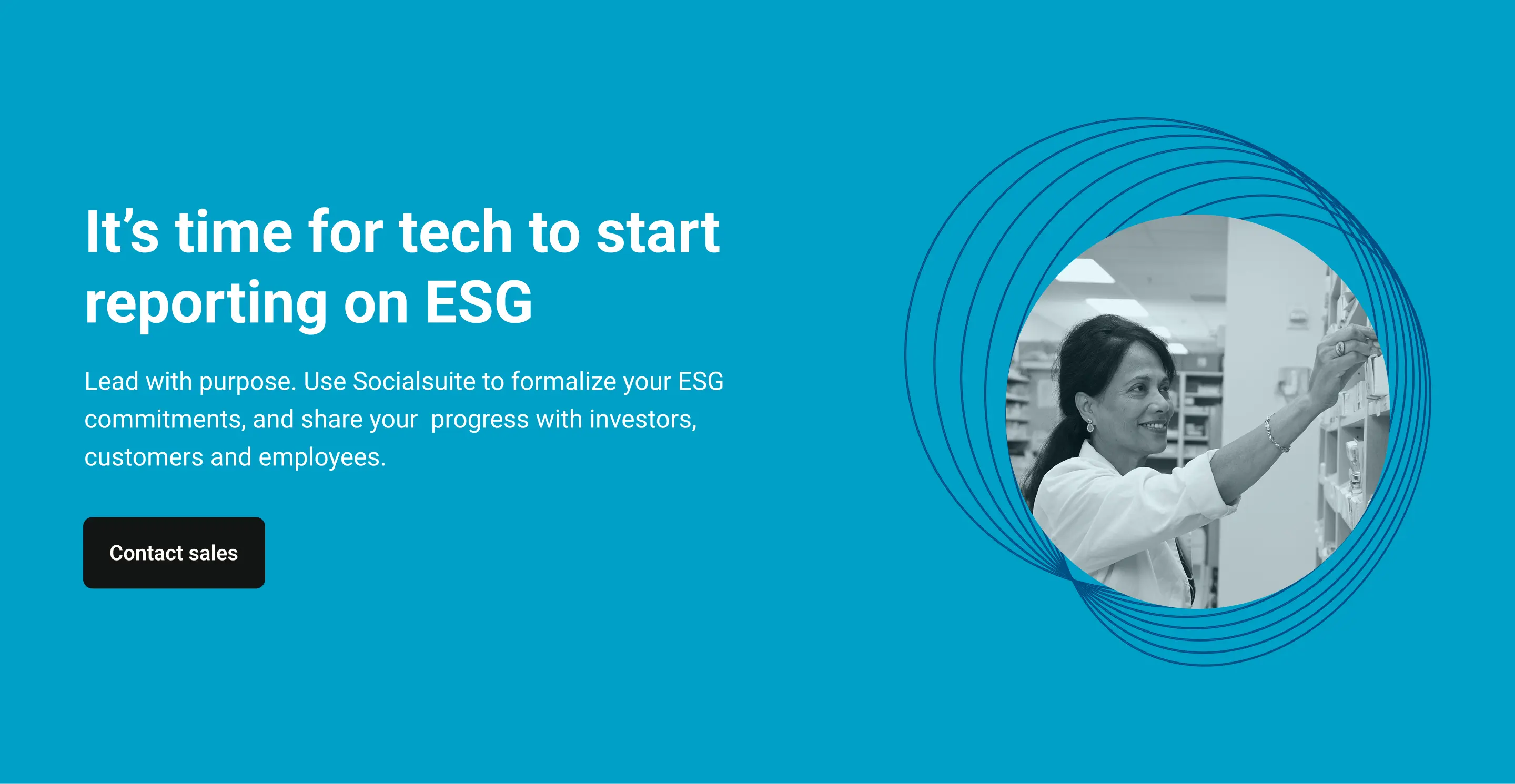
Circular Frame System
Inspired by the client's new logo geometry, I created a series of circular frames using concentric line work. These frames served multiple purposes:
- Brand consistency: Echoed the circular motifs in the updated logo
- Visual hierarchy: Drew attention to key imagery while maintaining clean layouts
- Versatility: Worked across both nonprofit (warmer, human-focused) and corporate (cooler, professional) contexts
Photography Treatment
- Black-and-white photography for timeless, professional feel
- Subtle color overlays derived from brand palette (teal, blue, green gradients)
- Real people in authentic moments—no staged stock photography
- Images showing diverse industries: nonprofits, mining, tech, manufacturing
Expanding the Logo Concept
The SocialSuite logo is constructed from overlapping circles—a visual representation of connection and impact. When the team decided to move away from traditional illustrations entirely, I saw an opportunity to expand on this circular language as a design system. By using concentric circles, overlapping geometric shapes, and circular frames throughout the site, I created visual interest and brand cohesion without relying on illustration.
Those circular elements became the "illustrations"—adding depth and visual appeal to sections that would typically feature custom graphics, while maintaining the clean, professional aesthetic the rebrand required.
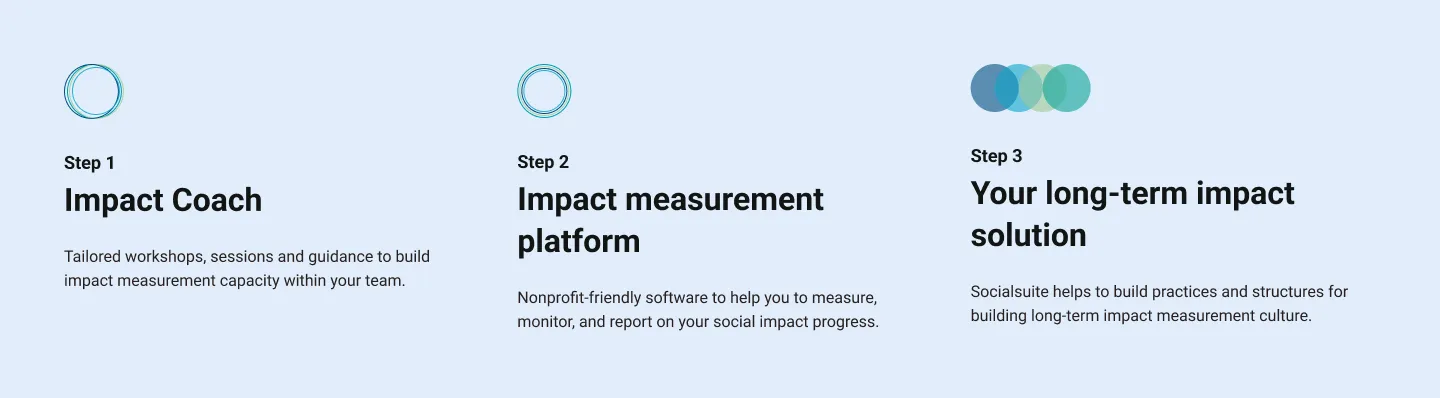
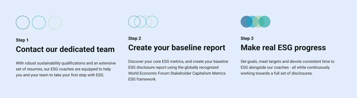
Icon System
To ensure visual consistency across all touchpoints, I implemented the Phosphor icon library—a free, open-source, MIT-licensed icon system. The duotone style aligned perfectly with the brand's modern aesthetic while providing the SocialSuite team with a comprehensive library for use across their website, product interface, and marketing materials. This created a unified visual language that extended beyond the website redesign.
Project Images